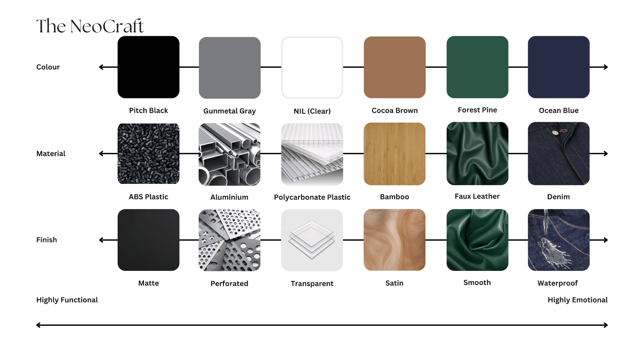
To celebrate the launch of the latest Dyson and Aftershock gaming mouse, I am assigned to propose an exclusive gaming mouse concept that embodies key elements of Singapore’s identity through the innovative application of colour, material and finish (CMF). My proposal should express the unique physical elements of Singapore and be thoughtfully crafted to balance aesthetic appeal with functionality, demonstrating a sophisticated understanding of how colour palettes, textures, and finishes can enhance both user experience and product distinctiveness.
Singapore Themed Mouse

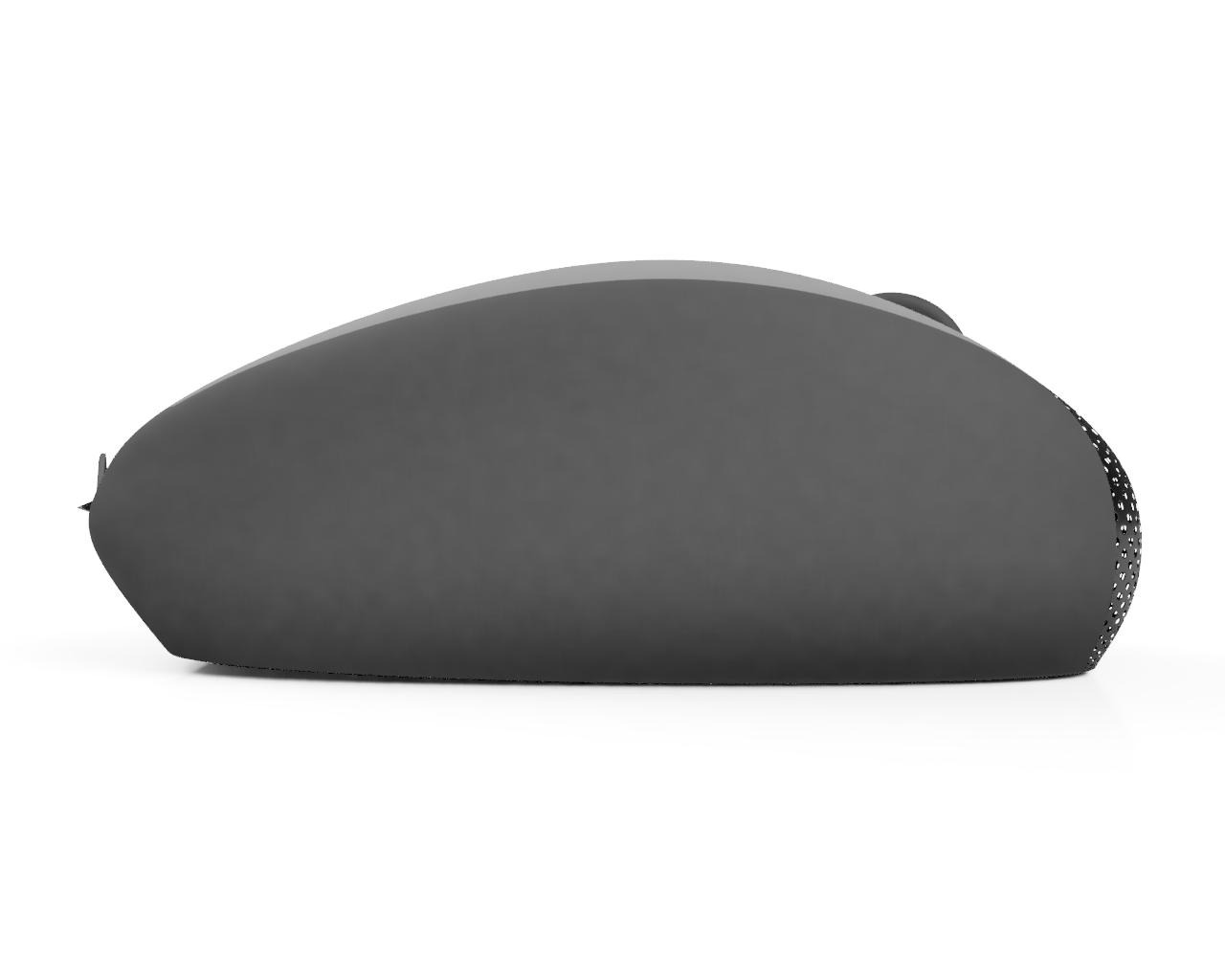
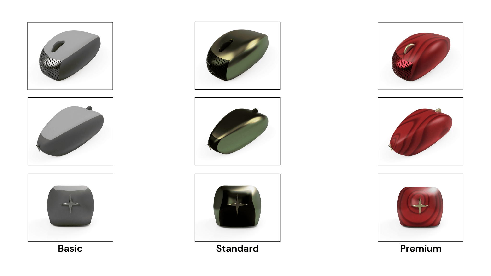
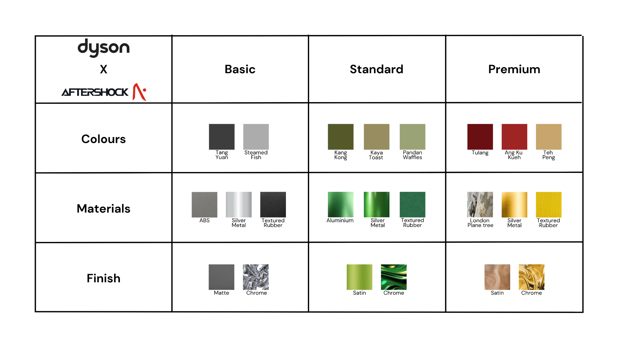
Basic
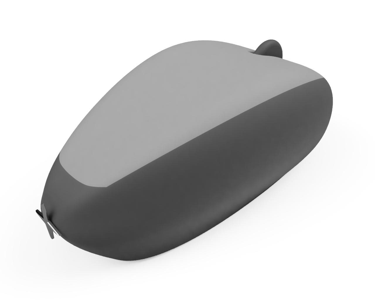
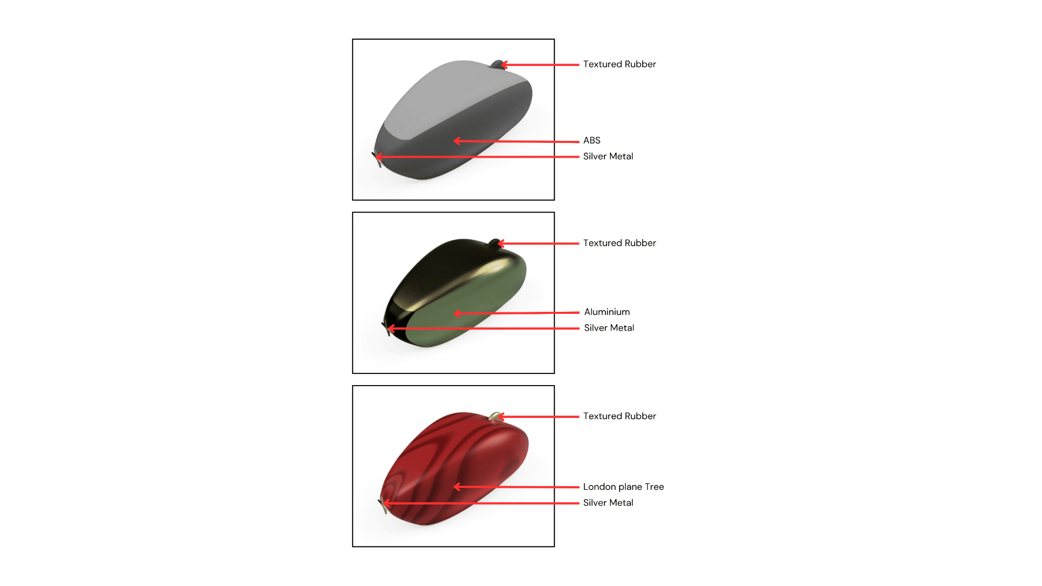
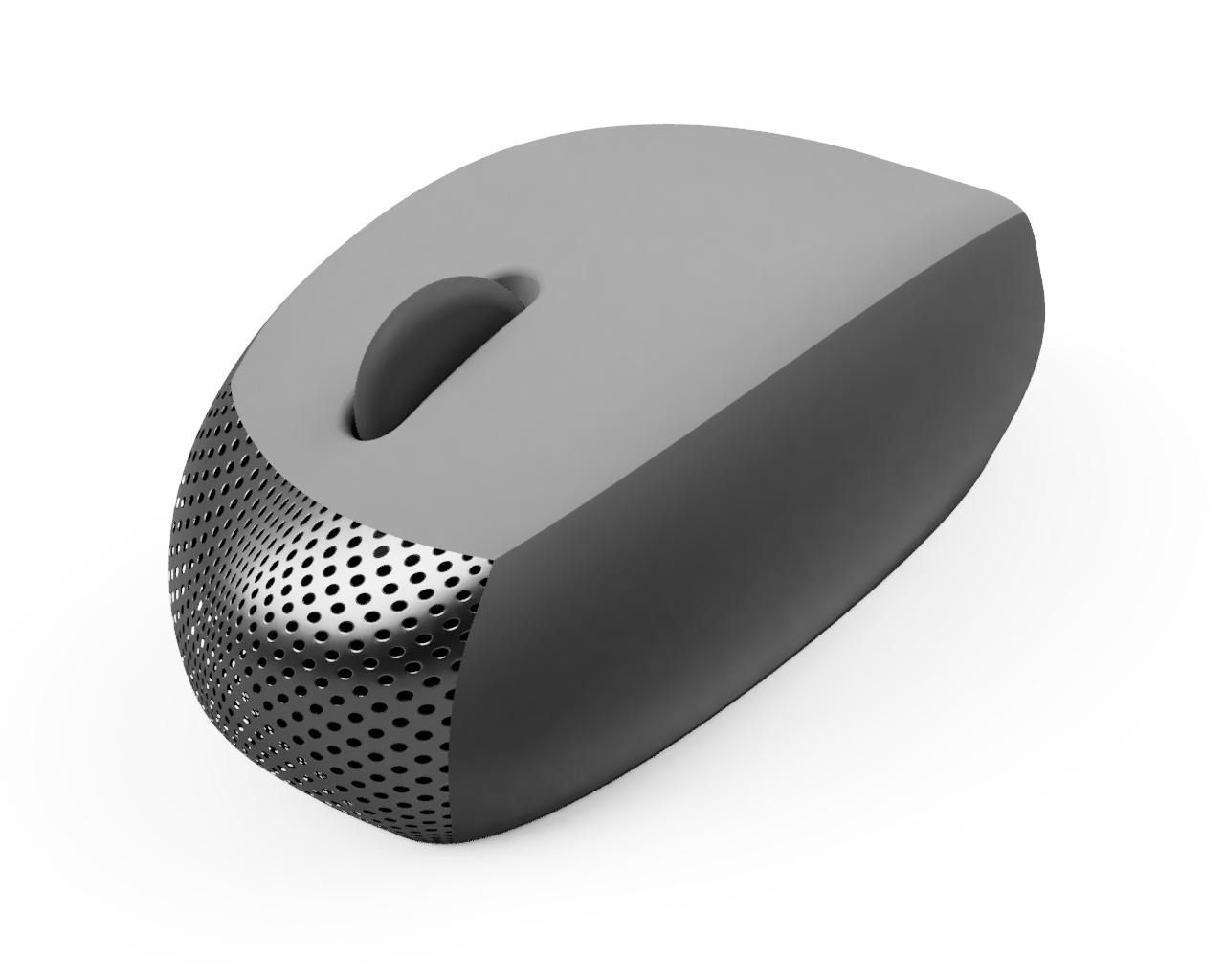
Name: 老 (Lǎo)
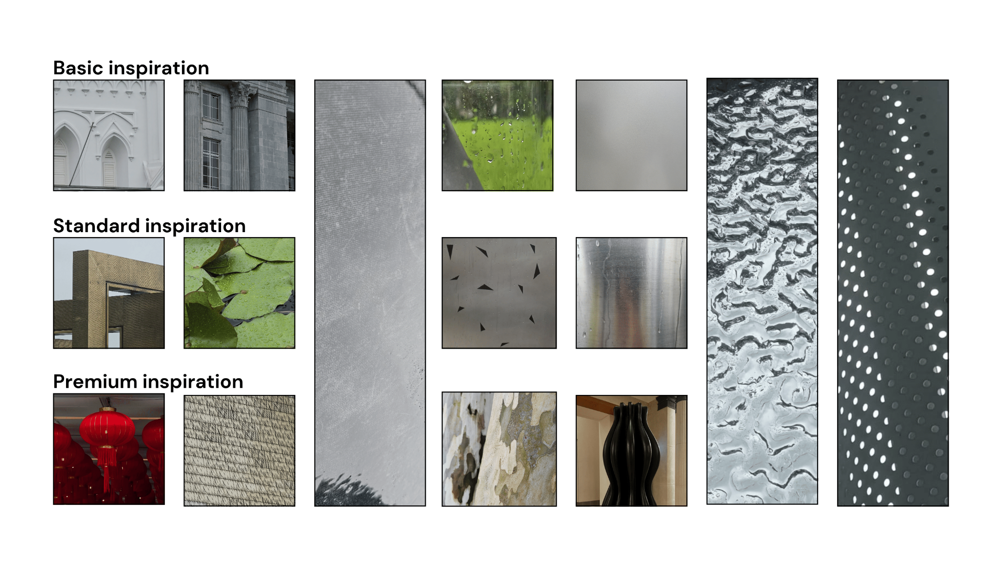
I chose to incorporate different shades of grey because, during my learning journey, I walked past historic buildings, heritage sites, museums and statues. Most, if not all, of it was in shades of grey and white. These structures have been here for years, and Singapore has an ageing population, symbolised by grey hair. So, I used the word ‘old’ but opted for its Chinese translation, ‘老 (Lǎo)’ to keep it lowkey.
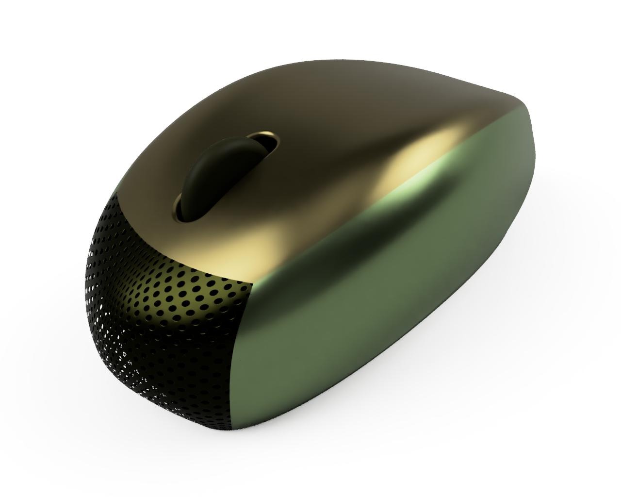
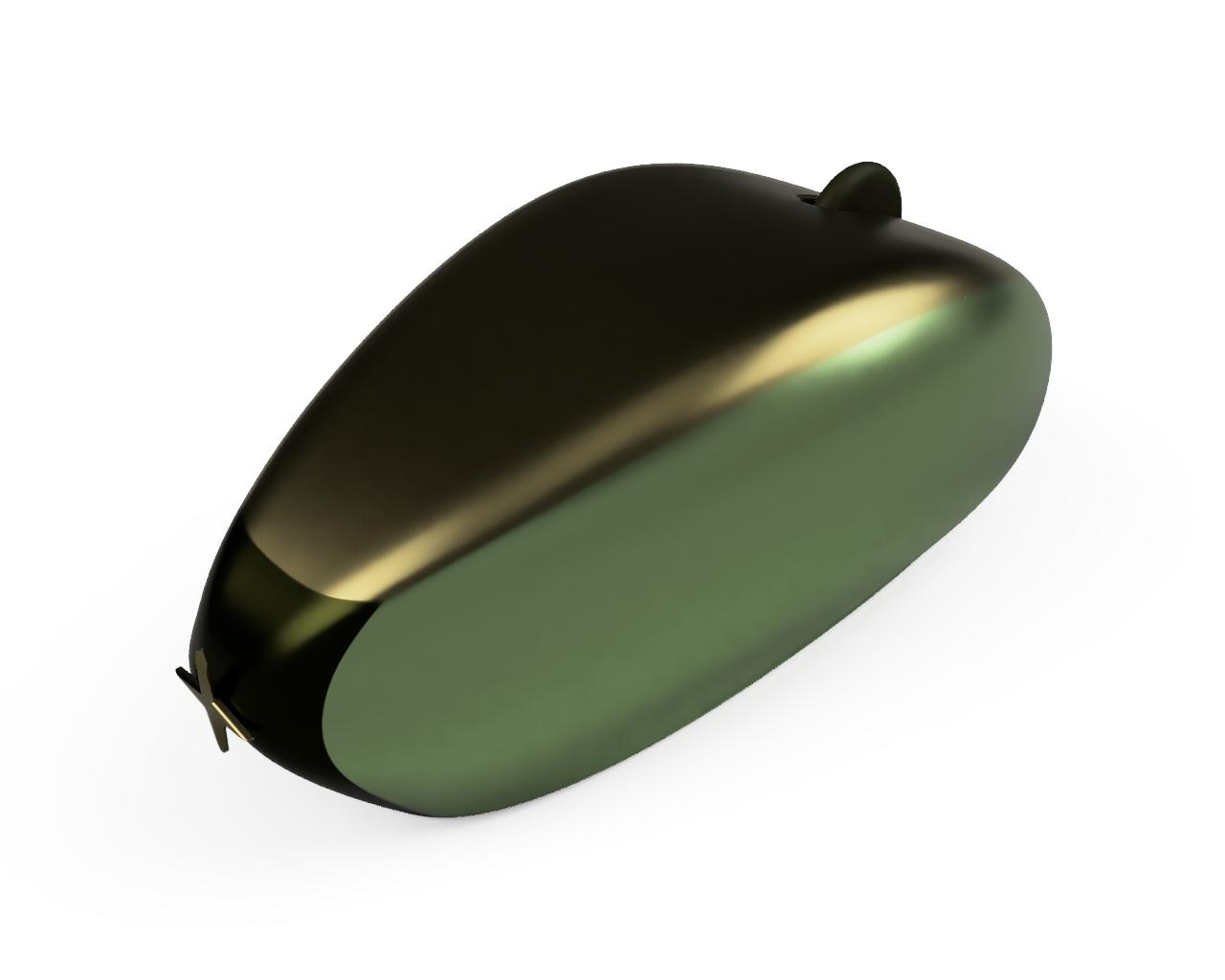
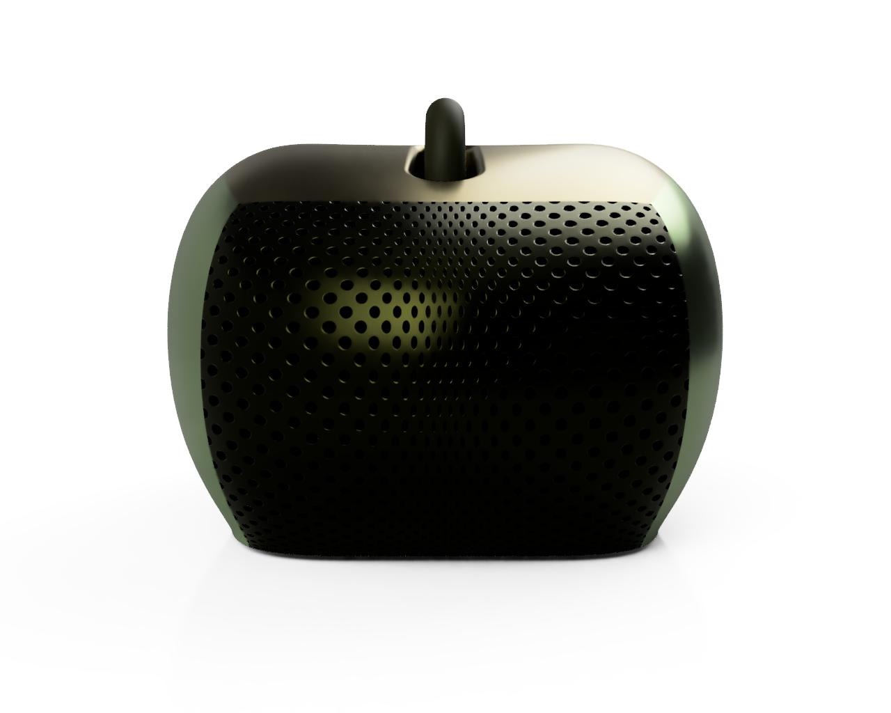
Standard
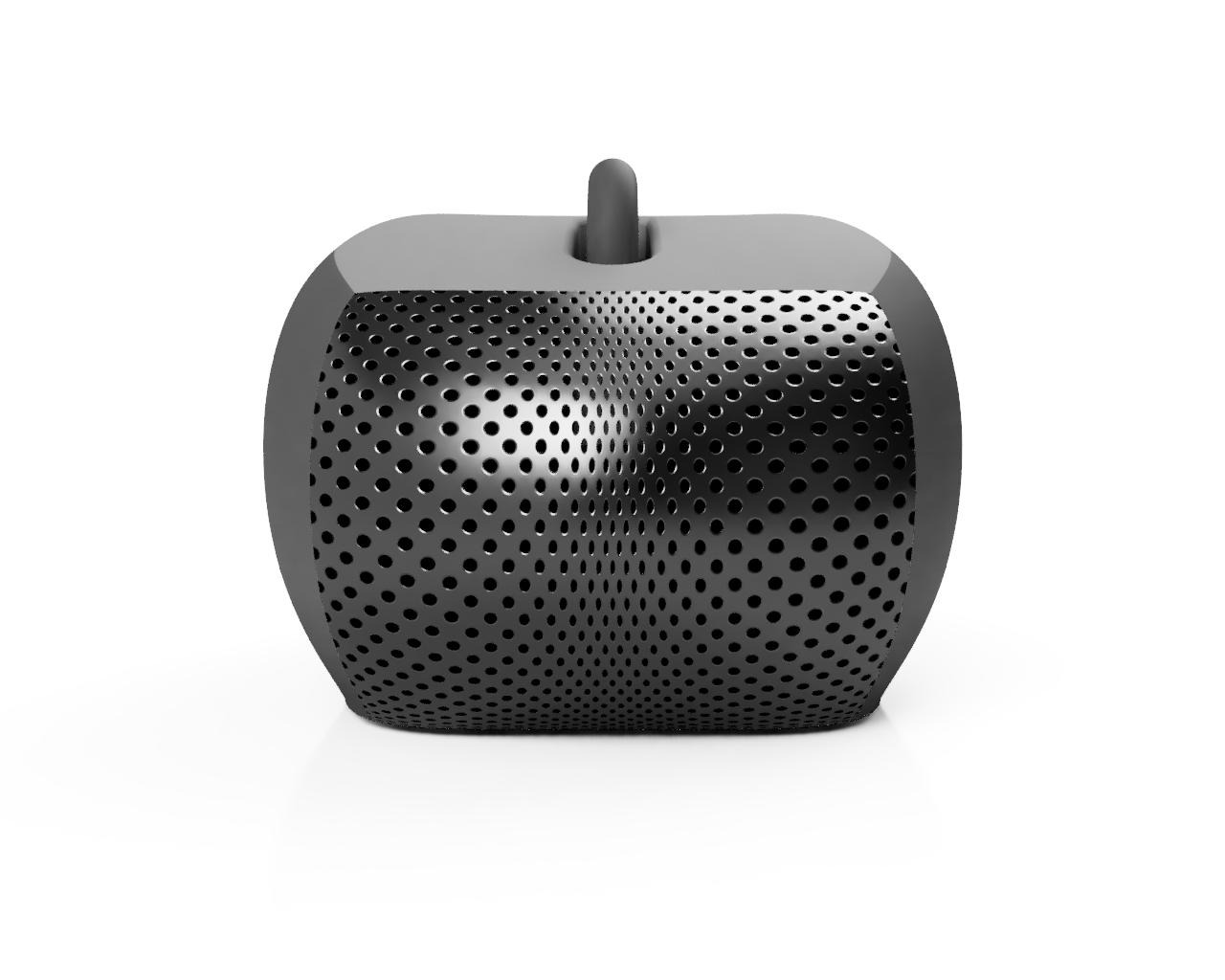
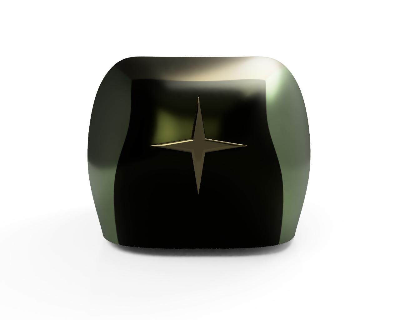
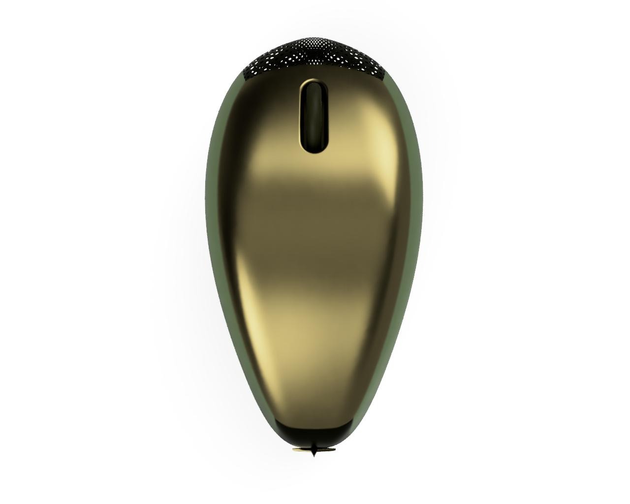
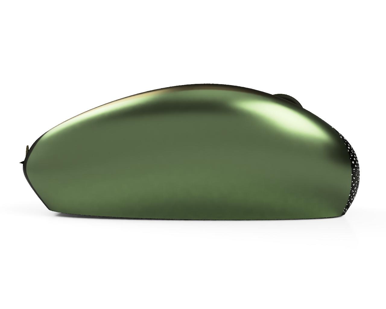
Name: Green City
I chose to incorporate different shades of green in the mouse because, during my learning journey, I was surrounded by an abundance of trees and plants. I tied this choice to four factors: the camouflage National Service outfit, Hari Raya celebrations (where green is a prominent colour), Singapore’s ‘Going Green’ movement (promoting the 3Rs and sustainability), and Singapore’s identity as a Garden City. The mouse features an abundant use of green, and its design is inspired by factors associated with the colour. Singapore is also considered a city-state. Hence, I decided to sum it all up with ‘Green City’.
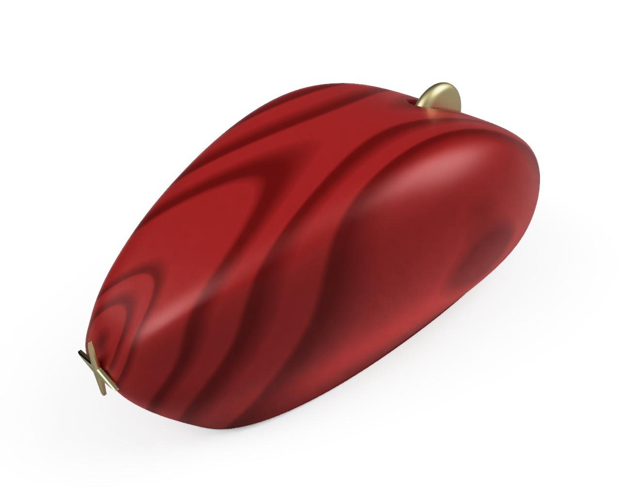
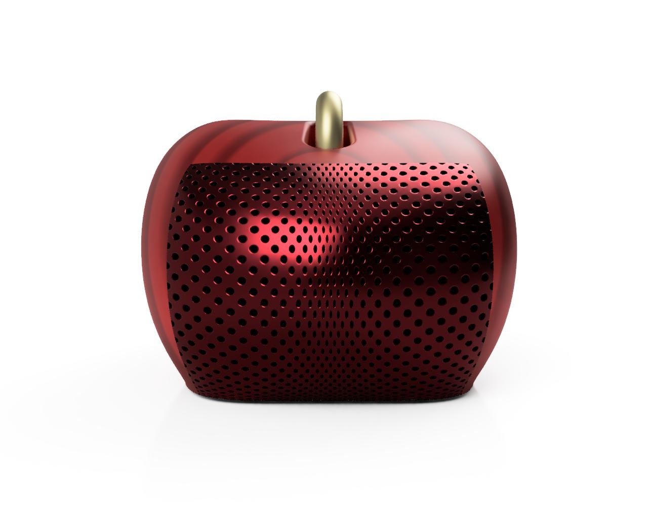
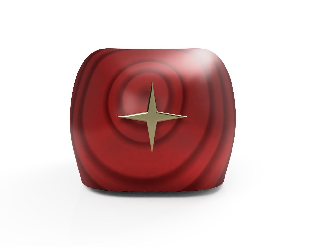
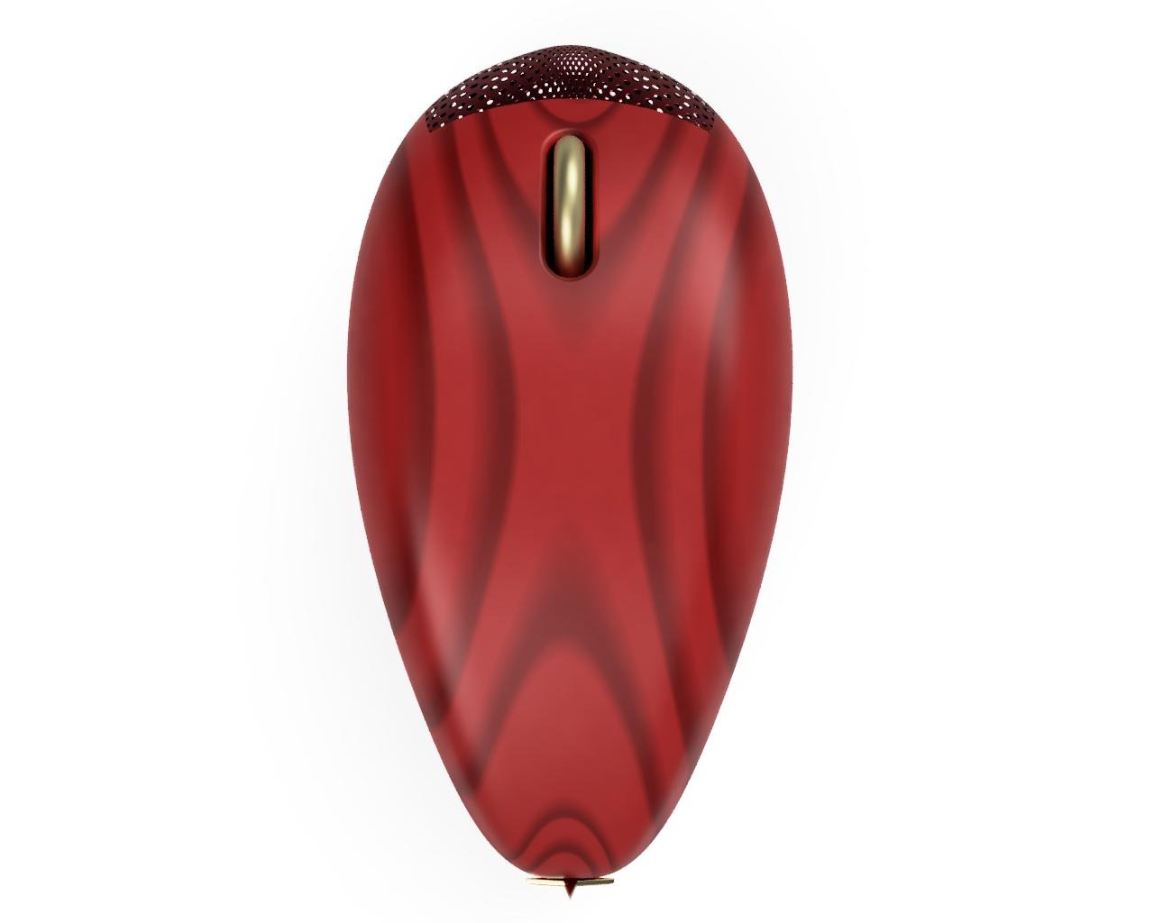
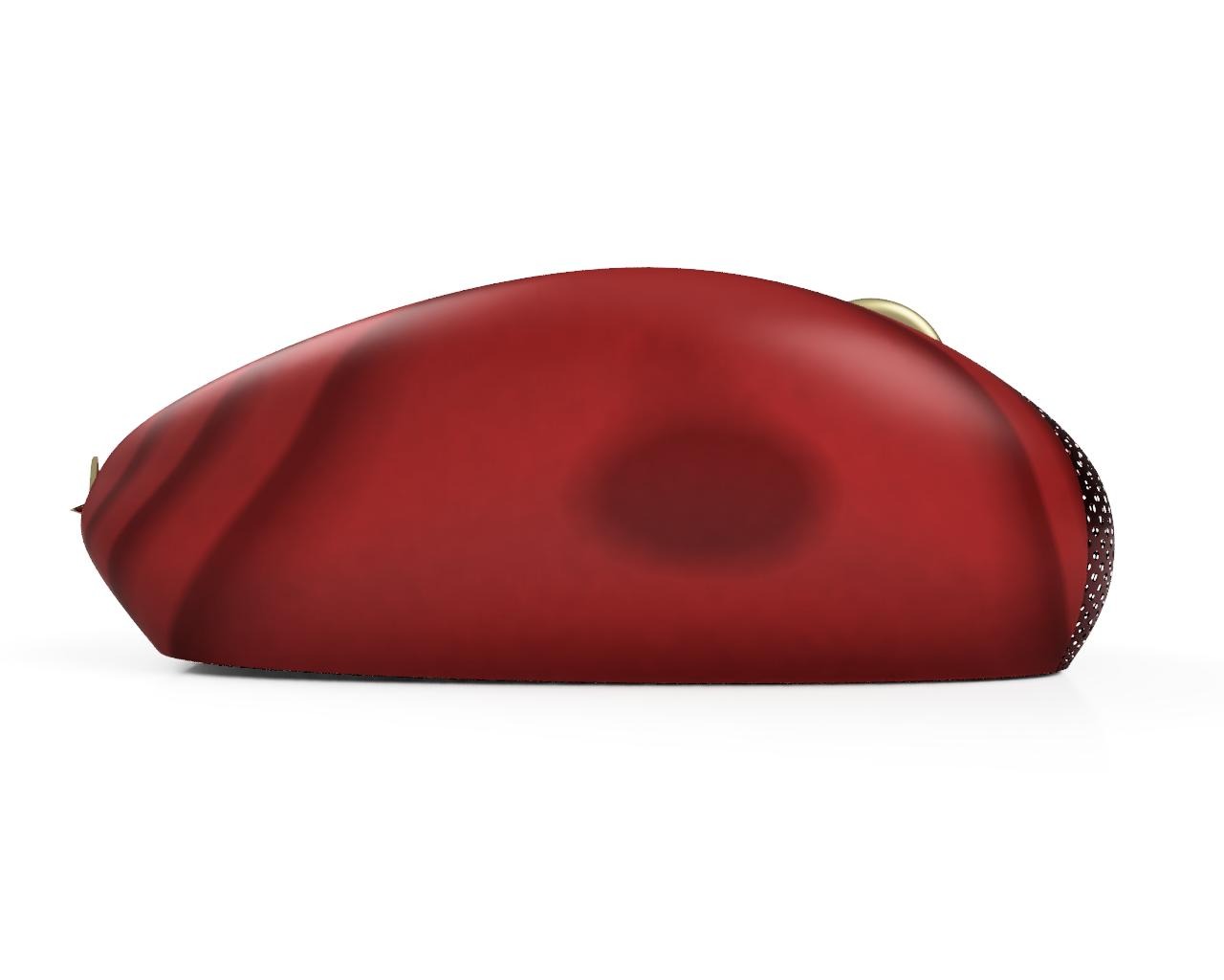
Premium
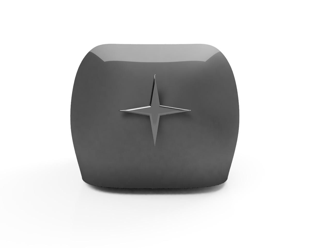
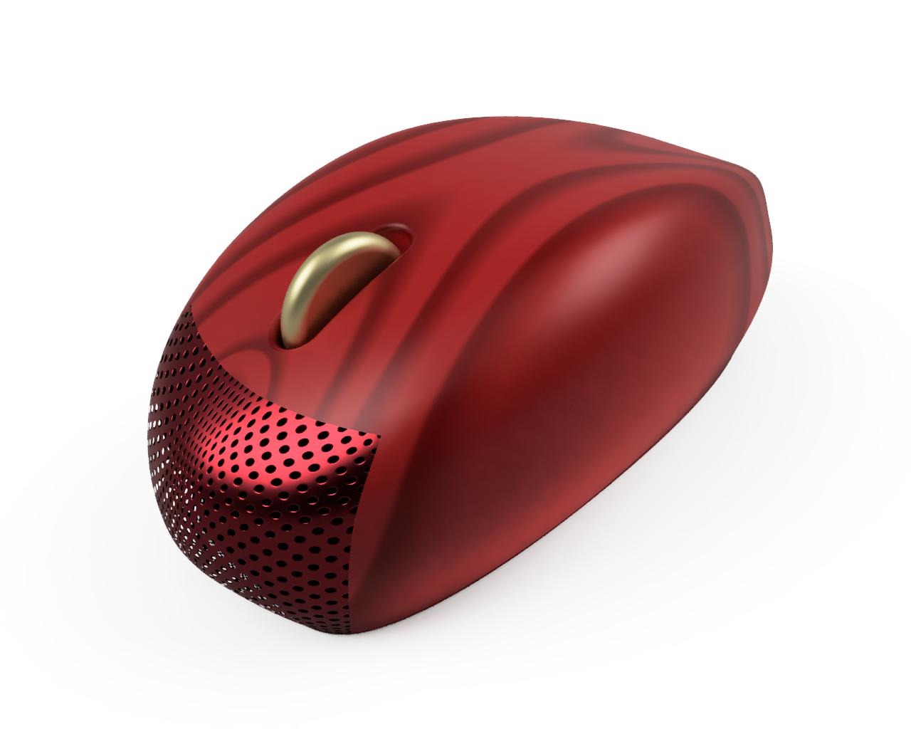
Name: Huat
I chose wood for the body because it is both reusable and recyclable, aligning with Singapore’s sustainability efforts. Specifically, I selected London Plane Wood after coming across the tree while walking towards the Fullerton Hotel. I found it unique, as I had never seen it before, and it had a distinctive pattern. These are some of the reasons I felt it deserved a place in the Premium category. I chose red as the main colour for the body because, during my learning journey, I saw many Chinese New Year decorations, and rows of red lanterns hanging outside The Fullerton Bay Hotel Singapore. Additionally, I noticed numerous Singapore flags, which also inspired the use of red. For the scroll wheel and star, I chose gold because, as mentioned earlier, there were many Chinese New Year decorations. I was also inspired by a striking golden roof I saw at the National Gallery of Singapore. I came up with the name ‘Huat’ because it’s Singapore’s 60th Birthday, which I think of as a Golden Jubilee. Since red and gold were used, I felt that this name complemented the aesthetics of the mouse.